The navigation menus for a LymeTemplate based app are configurable to deal with common business scenarios.
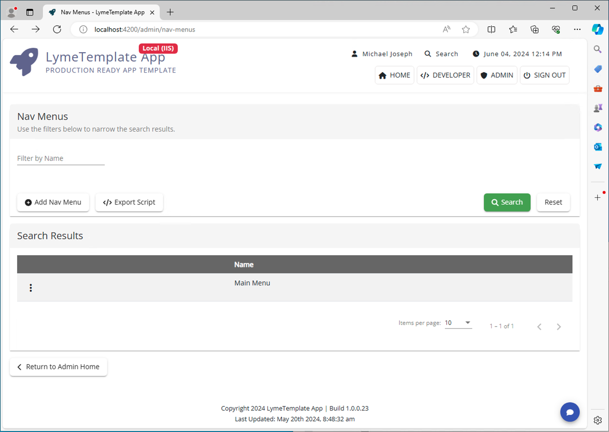
Upon navigating to this area from the Admin Home, by default only one menu is defined. You can add new menus for other purposes if you need to, but the template only uses the one.
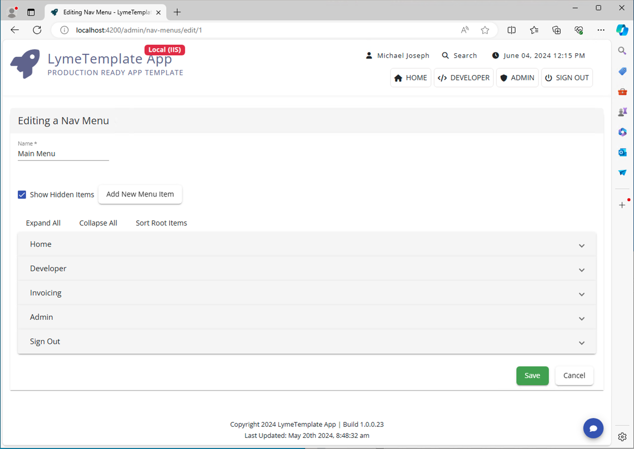
When clicking the context menu next to the Main Menu and selecting the "Edit" option, we will see the root structure of the app's navigation menu:
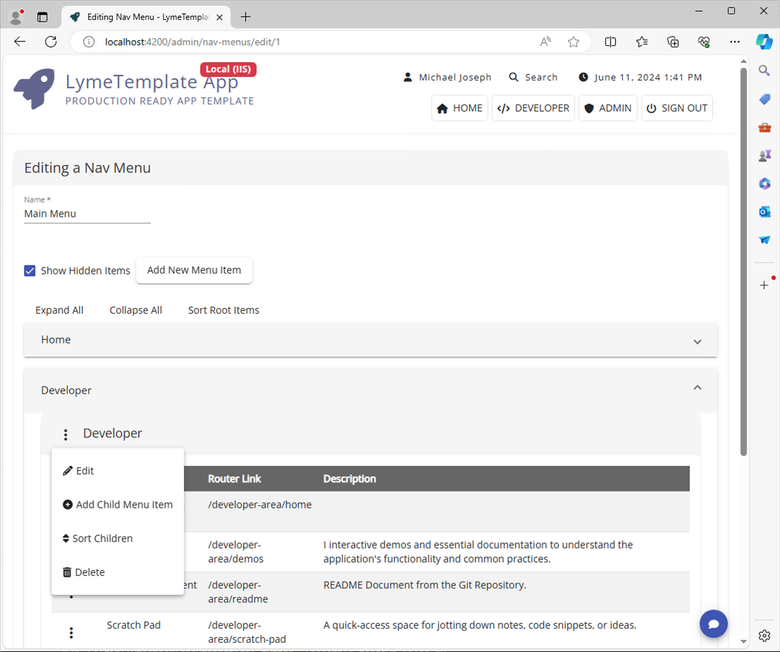
Clicking on any of them, will expand and view child items. Clicking a context menu next to a menu item will show an assortment of available options:
Explanation of Options:
Edit - Brings up an form to edit an existing menu item.
Add Child Menu Item - Brings up an form to add a new menu item.
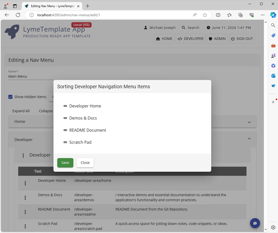
Sort Children - Brings up a modal to allow a user to sort menu items.
Delete - Deletes the selected menu item.
When sorting a list of menu items, a modal similar to the following would be displayed. Use the drag handles to change the display order.
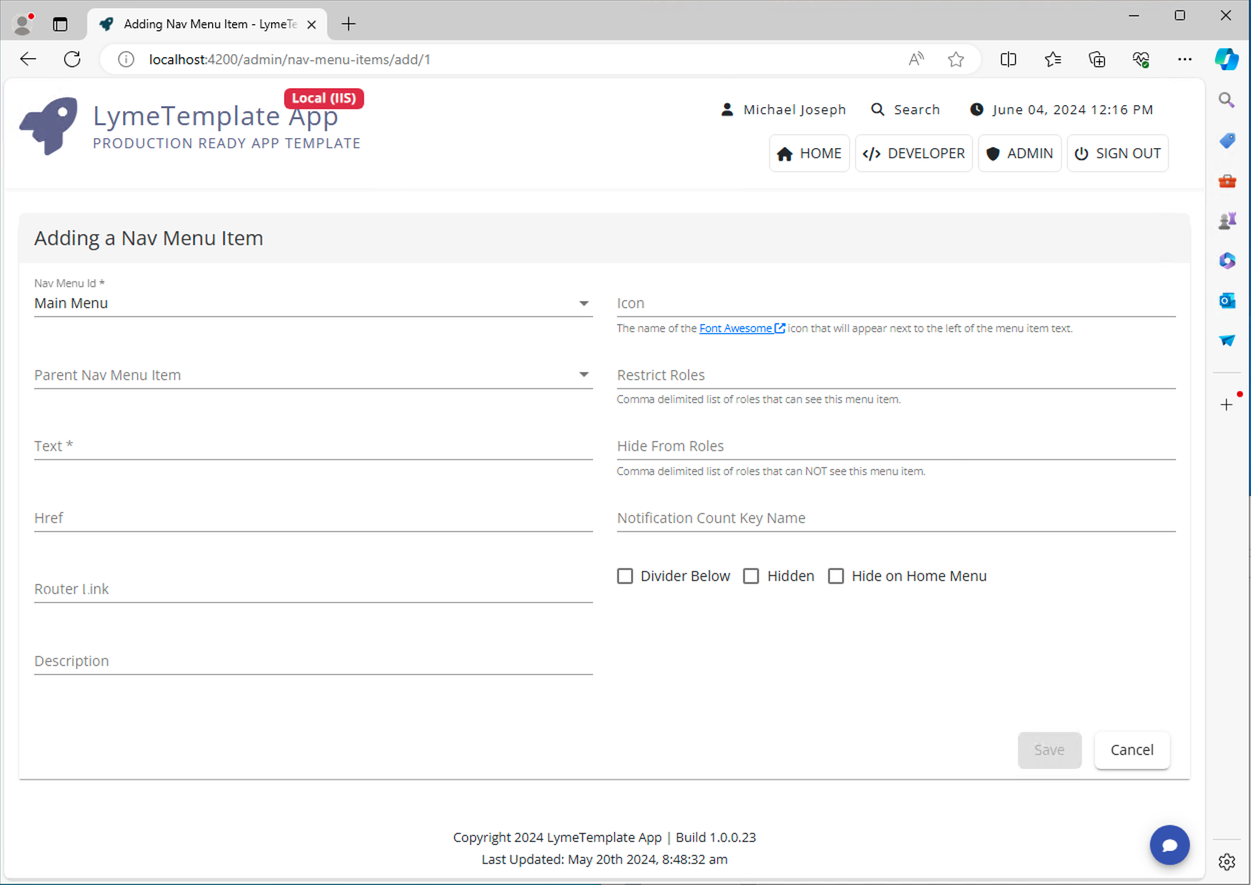
Nav Menu Item Form
When adding or editing a Nav Menu Item, one would be presented with the following form:
Nav Menu Id - The menu that this menu item will belong to.
Parent Nav Menu Item - The menu item that this menu item appears under. Leave blank if this menu item is to appear at the root level.
Text - The text that will appear on the navigation menu item.
Href - optional - Any fully qualified URL (http:// or https://) - external links will appear in a new tab or window.
Router Link - The route in the Angular app that will be the target of navigation. e.g. /admin/users
Description - The text that will appear in a card menu or accessibility interfaces.
Icon - The optional icon that will appear next to the text. Use fully qualified fontawesome syntax. e.g. fas fa-home
Restrict Roles - A comma separated list of roles to limit the display of this item.
Hide Roles - A comma separated list of roles for which to hide this item.
Notification Count Key Name - The Real Time Data endpoint contains a key/value paired list of Notifications. If the notificationKeyName equals the value of this field, that notification bubble will appear next to the nav menu item.
Divider Below - Indicates whether a line should appear below this menu item.
Hidden - Whether a menu item is hidden. Results will still show in the site's Quick Search function.
Hide on Home Menu Component - This menu option will not appear when its nav menu item is implemented in a <app-home-menu></app-home-menu> instance.